A banner stand is undeniably the most important investment you can make for your trade show presence. Without an effective display stand, you risk remaining unnoticed by fellow delegate and visitors, which will not bring about your desired return on investment. Since it is not cheap to attend trade shows and exhibitions, maximise your presence by taking time to design the perfect stand. Your images and graphics go a long way to creating the stand that everyone is talking about for all the right reasons. Unfortunately many people spend thousands on a stand then use the poorest graphics they find, which hardly adds up to a positive impression. Here’s how to use graphics on your banner stand to your best advantage.

1. Invest in Professional Help
If you want the best graphics on your exhibition banner stands and you are not a graphic designer, then hire one. Don’t leave it to chance that you will be able to come up with something creative, and understand what resolution and file type to use. If you are unsure, get professional help right from the start.
2. Pay Attention to Image Quality
Every image, and every graphic, should be high resolution – it simply will not work if your graphics are low res. What’s fine for the web or even a printed publication will not work when blown up large on a pop up banner. Don’t use images and logos from your website; get the raw files from your marketing department or your own collection.
3. Scale Your Graphics
Making everything bigger is great, but the graphics also must fit to scale or they will look ridiculous on your large roll up banner. If you are unsure how to properly scale your graphics, get professional help. It is easy to make a mistake on this, but trust us – it really does look bad.
4. Be Careful With Colour
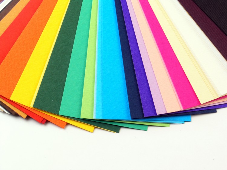
Colour can be the making of your Pop up Banners but also your downfall. Make sure you get the exact colour you are looking for by working with Pantone swatches and being clear about your colour needs with your designer. The smallest difference in tone can make a big difference to the overall effect of your graphics.
5. Get the Details Right
Don’t just think about the images, you also need to consider the colour, the font, the amount of text, the layout – and how the banners will interact and fit with the rest of your display. Paying attention to the details helps you create a standout display that people won´t walk past, but will notice and admire.

